While doing research for a recent packaging design project, I came across the work of an illustrator I had not heard of before. I was so taken by his work I thought it would be worth sharing.
The design project is for a collection of men’s products to be called ‘Art of the Gentleman’ which includes categories for grooming, accessory organization and wine & spirit accessories, all marketed to the ‘modern’ gentleman.
The project came with specific direction from the marketing department so I was able to begin with a good idea of what was wanted. At the top of the list was a request to create a contemporary, upscale design but with a ‘1950s or 60s retro feel’ and to somehow graphically represent a stylized gentleman on the packaging (possibly as a logo that could incorporate the brand name). It was also suggested (no surprise here) that I consider the ‘black silhouette’ style used in the opening of ‘Mad Men’.
I began my research with a promise to myself that I would not simply ape the Mad Men look but find some other inspiration that would be just as representative, and also be a jumping off point for creating an original design. As someone with a rather large collection of art and design books, my first place to look for stuff from previous decades is my own reference library. And in thinking about representing the classic gentleman (cool guy in suit), I reached for a book I have on Art Deco that includes the work of Tom Purvis.
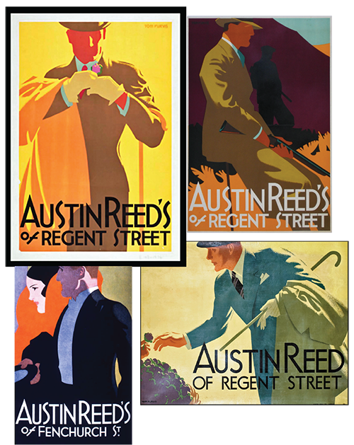
Tom Purvis (1888 –1959) was a British painter and commercial poster artist who produced some of the most stylish and influential images of the modern, urban man in the 1930s. His most famous posters were created for the London & North Eastern Railway, but his work for the outfitters Austin Reed are the one’s that attracted me. The clean, graphic two- dimensional renderings of his men have very little detail but are full of style and sophistication (sort of a stripped down version of Leyendecker). His flat colors and posterized style seemed like a good way to go. Logo designs were forming in my head simply by looking at his work.
Check out House Of Retro to view more of his amazing poster designs and learn a little more about his long successful career.
As much as I got out of the 1930s minimalist work of Purvis, I felt I should continue to research art that was created closer to the decades I was asked to reference. So I googled multiple variations of ‘1950s man in suit’ and began the image scrolling process. This was where I discovered the work of an illustrator I had not heard of before.
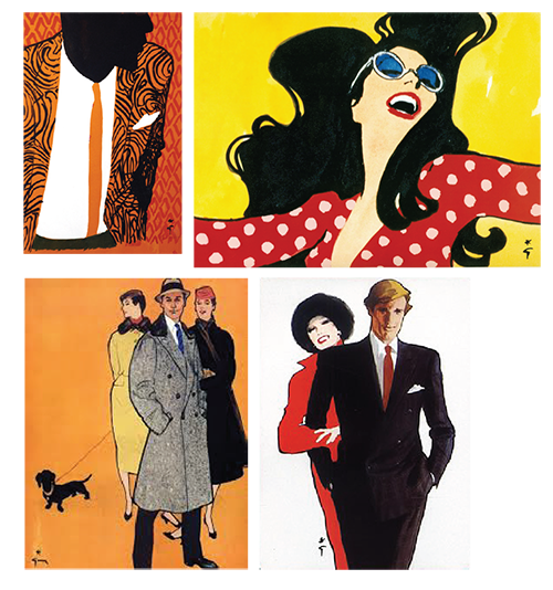
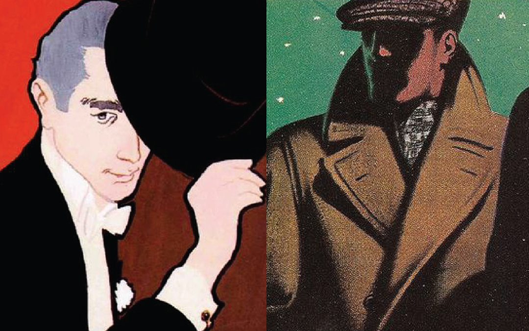
René Gruau (1909-2004) was a fashion illustrator who became one of the best-known artists of the haute couture world during the 1940s and 50s. Working for many of those years as Artistic Director of Advertising for Christian Dior, Gruau revolutionized the world of fashion illustration. He also contributed to Harper’s Bazaar and Vogue, and became the head designer for Flair magazine. His advertising campaigns for Moulin Rouge celebrated the famous poster graphics of Toulouse-Lautrec and the Parisian artists of the 1900s. His work in advertising included the poster for Fellini’s film “La Dolce Vita” in 1959 and he worked on campaigns for Air France, Martini and Omega watches. A long and successful career indeed. Gruau died in in 2004 at age 95. To learn more visit his official site, or A-Gent of Style, which has a nice bio.
 I found his loose, fluid brush stroke style beautiful, and although he drew mostly women, there are quite a few images of men I managed to find which are also very striking and original. I thought this was a style worth exploring as it would be a nice alternate to the more hard edged linier style I typically work in. Out of the 6 concepts I presented, only one had the ‘Gruau’ look and it was shot down almost immediately as not being ‘masculine’ enough. As there was no elaboration on this comment (in this business, when something gets rejected you rarely get a chance to go back and ask why, you’re just happy if something gets chosen), I can only assume it was the brush stroke approach coming across as too feminine for a men’s product.
![]()
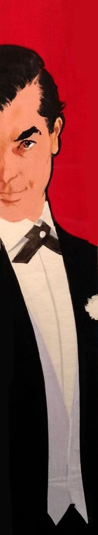
In the end I was happy with what was chosen, and with the help of my Creative Director I was able to refine the logo design, packaging and photography to a point where I am quite proud of the finished design: a nod to the 1950’s look but also something original and contemporary. At least I think so. See additional finished designs in the packaging section of this site.