
Occasionally, the planets align and I receive a design project that has a theme I not only am familiar with, but also a true fan of. A good example of this is a branding project I was awarded a few months back. I would like to share the inspiration, concepts and rough sketches for this project.
The brief was short and only stated that the marketing idea was for a series of tabletop board games and app games centered around the player escaping from, and fighting off, invaders from another world: a popular and common theme that we have seen time and again.
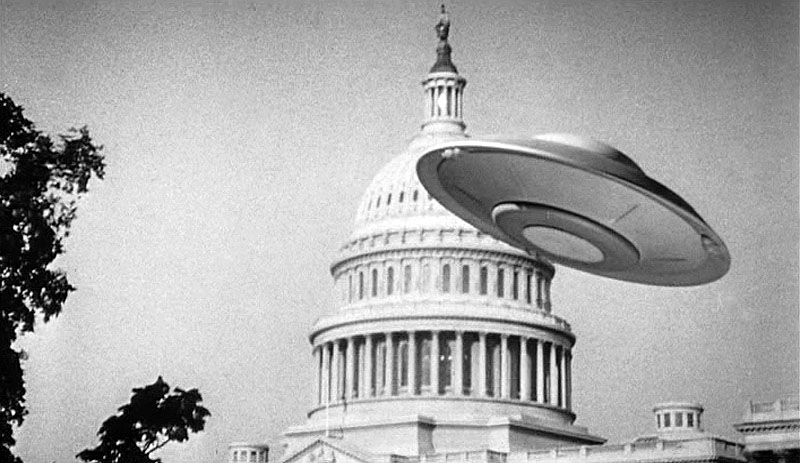
The goal was to keep the category playful, non-offensive and mostly non-violent, as this would be for users of all ages. It was decided to use a retro approach, taking cues from those wonderful but somewhat naive 1950’s science fiction films. Easily recognizable, this era of sci-fi continues to speak to a wide audience. It also has enough history and visual reference to make any graphic designer happy. (Especially this one!)
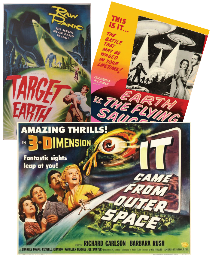
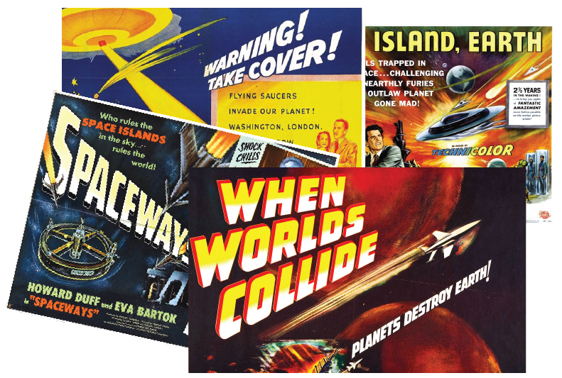
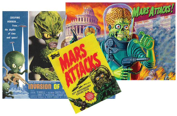
With limited direction and not much time, I leapt into research mode. (At this point, the brand had not been named.) Using Google images and the handful of books I own on the subject, I came up with more than enough reference. Below is just a small example of the artwork that’s been done in this genre during the 1950’s and I was instantly inspired by some of the type treatments and imagery.
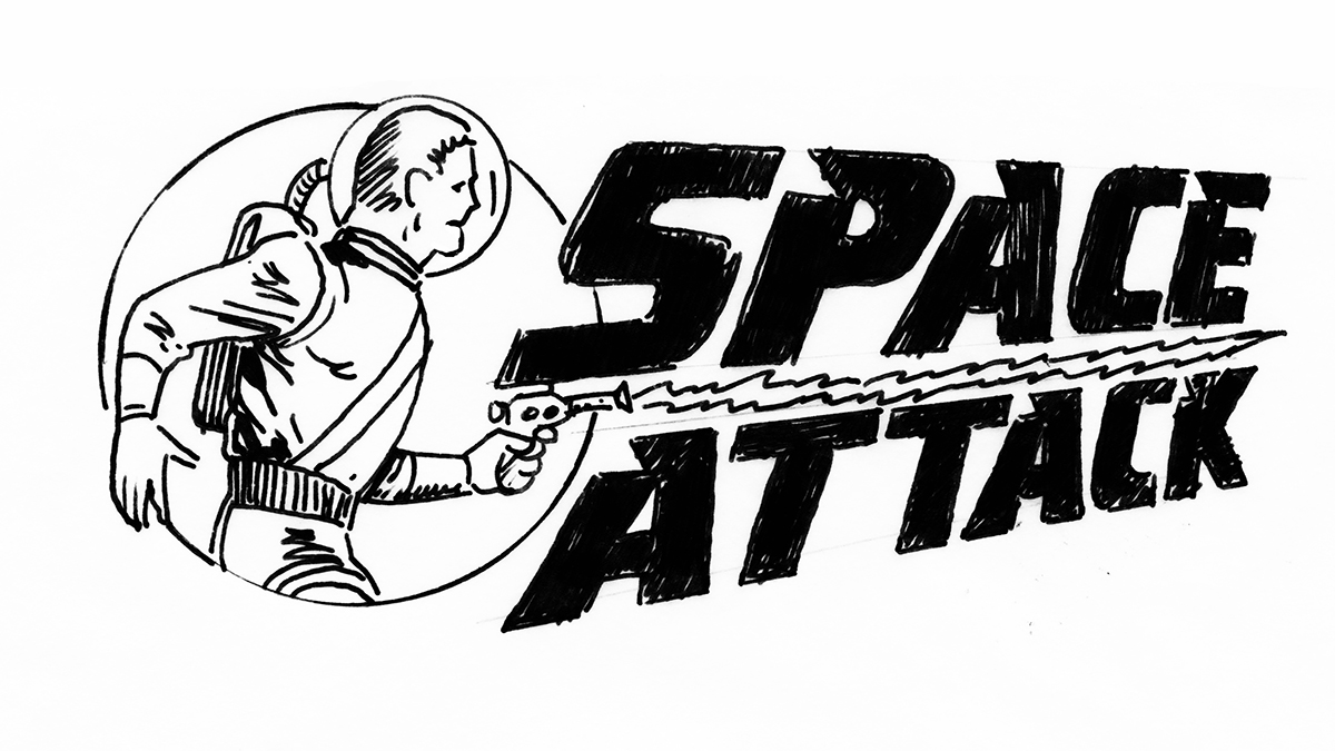
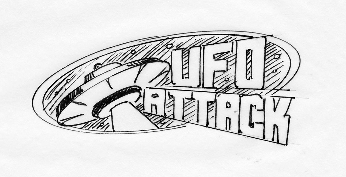
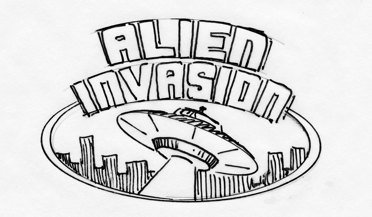
Once these images were absorbed and put aside, I began to sketch ideas keeping in mind that this would be a logo that needed to be simple and quickly understood at a glance. Below are just a few of the many ideas I sketched out in marker to quickly generate name and visual concepts to present to the client. I find presenting rough sketches or thumbnails at this stage helps the client stay focused on the idea and not get caught up in the details.
Based on the feedback received from the b/w sketches, I was able to put some time into more finished designs in Illustrator. The marketing team really liked the ‘flying saucer with shooting ray’ visual but I wanted to take a few other concepts a little further as well. The type treatment would play a big part in referencing 1950’s sci-fi, so I made sure I worked in styles that were iconic of the genre, like the dimensional lettering for “When Worlds Collide”, “Spaceways” and so many more. I have always loved the drippy hand lettering used for “Mars Attacks” and “Target Earth”, so that look also worked it’s way in.
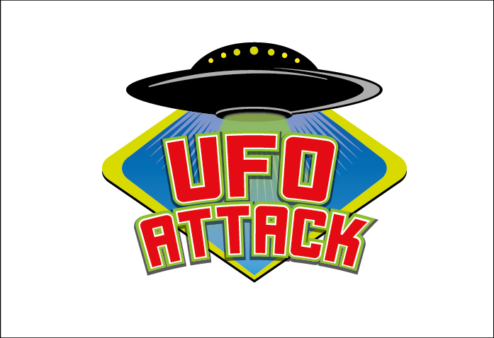
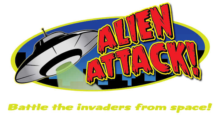
Twelve designs were then presented in color, rendered in Illustrator. The concern for simplicity and legibility came up again, and I agreed with the comments that using figures such as a spaceman or alien creatures made the logo too busy. With the narrowing down of imagery, I knew I was close to having an approved design. Below are a few of the logos presented.
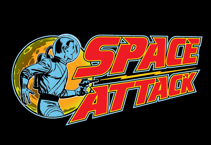
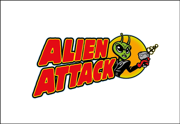
Finally, a brand name was chosen, a design was approved, and ‘Alien Attack!’ was born:
Unfortunately, it didn’t live for long as the product concept was dropped soon after I finalized the chosen logo. This was one rocket ship that never got off the ground. Still, it was a fun project and it got me watching a lot of those marvelous old films! I’m still hoping I’ll get that call saying it’s back in the works, but in this business you never hold your breath!