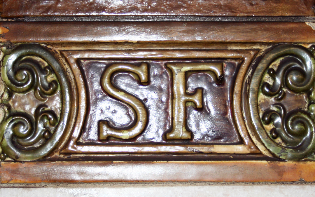
With a name like Stephen Foster and the initials SF, coming across them when it’s referring to something or someone other than myself is not uncommon. Be it the name of the famous composer of hummable hits like ‘My Old Kentucky Home’ and ‘Camptown Races”, or the initials referring to professional sport teams in San Francisco, there’s a lot of SF competition. Below are just a few of the SF logos and letterforms out there.
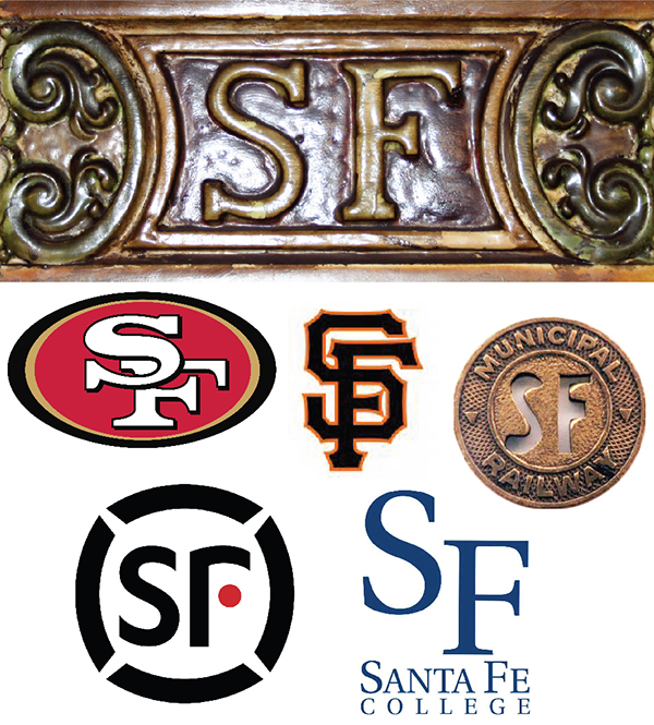
With so many varieties of SF’s already in existence (and some of them being quite well known), I was determined to make my design different and distinctive. A successful logo needs to be simple (but not simplistic), memorable, effective, and evocative of the artist’s particular graphic style. I think I achieved that. But as with every art form, its success is highly subjective.
My logo was developed not from scouring endless rows of popular fonts, as seems to be the current approach, but by drawing. The SF came from 5 horizontal lines drawn on a scrap of tissue paper while sketching out ideas. Good ideas that begin on the back of a napkin don’t just happen in the movies.
![]()
And with a few connecting vertical lines
![]()
![]()
I had my ‘SF’.
Obviously, to take a rough sketch and convert it into a finished logo takes a bit more effort. Once the art for the initials was created in Illustrator, I took the shape a step further by splitting it into 2 colors, but doing it vertically, in contrast to the very horizontal letterforms.
What made me believe this logo design was ‘the one’ was when I realized it had some flexibility in that I could rotate it, and give it some movement. Changing its orientation from page to page on a web site or printed promotion or from letterhead to business card brings an element of motion to the design when seen in repetition. And for someone who loves moving or animated type, this was cool.
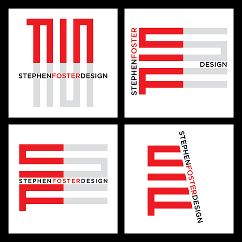
I discovered this flexibility during the process of adding the studio name to the initials. I wanted the name truly integrated with the initials so both become one, and came up with many combinations, rotating both initials and name, looking for the perfect marriage. In the end, I settled on the version seen throughout my web site.